Tomo Listings Portal
The listings portal for Tomo is the mortgage company’s first step towards building the Tomo Real Estate brand, and serving customers who are in their early homebuying stage with more personalized assistance and care.
→ Website
Branding
Before we started building out Tomo Real Estate’s visual identity, we had to align on an overarching Tomo brand mission and core principles that would manifest across the design.
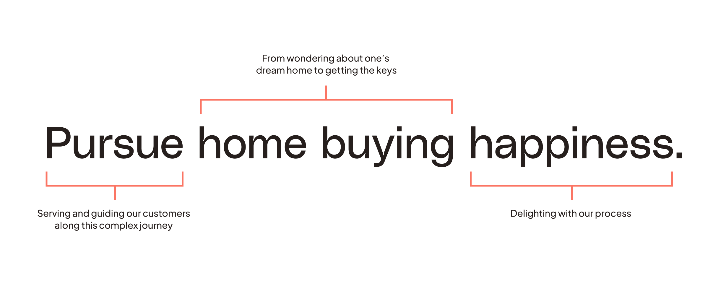
I worked with three UX designers to workshop the mission statement, “Pursue home buying happiness”, and principles we could point to in order to make actionable design decisions.
Mission
Core Principles
↳ Friendly
We’re excited to serve our customers and to guide them on their home buying journey to their dream home. Our language and design aims to welcome and support every step of the way.
↳ Engaging
We encourage exploration by finding the intersection of simple and engaging, and occupying that space so that finding a home isn’t daunting, it’s enjoyable.
↳ Guiding
Whether a customer is just beginning their home search or have been at it for a while, we're here to build upon what they already know so they can confidently take the next step. Our design keeps it light for the casual explorer but allows a serious researcher to go deep.
Tomo Real Estate Logo
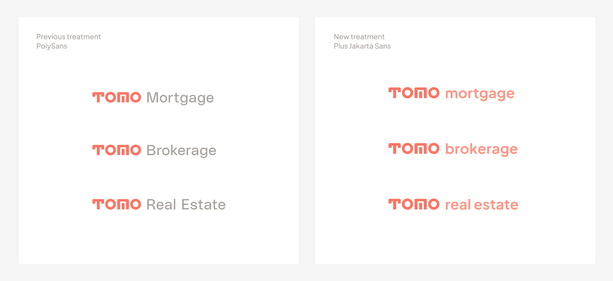
In this logo lockup refresh, we looked at updating the typeface that accompanies our main Tomo logo from PolySans to the friendlier Plus Jakarta Sans. Previously, PolySans was chosen as Tomo’s main brand typeface for headlines, but the usage of it in lockups always felt disengaged from the main logo. In order to better balance the lockup and keep the emphasis on the main logo, Jakarta is used in lowercase and has more geometric features that complement the sharp edges and rounded corners of Tomo.
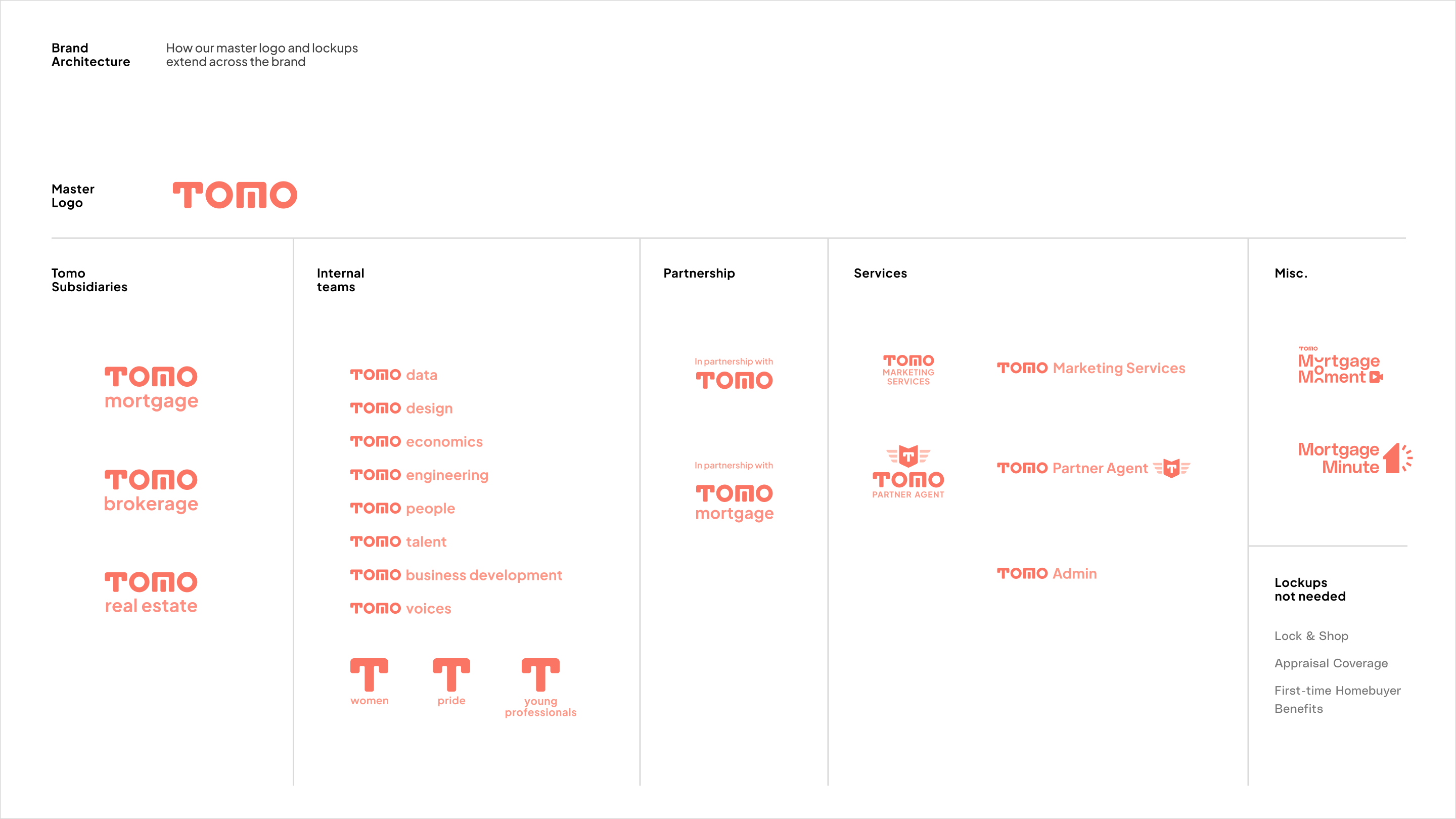
Along with the main Tomo subsidiary lockup updates, I also took a look at the whole brand and laid out Tomo’s brand architecture to ensure brand consistency and professionalism.
It also provides some structure to how we want to handle logo branding in the future.
It also provides some structure to how we want to handle logo branding in the future.
Product
The primary problem this portal tries to solve for is helping customers who are frustrated find their dream home. 70% of homebuyers gave up finding a home in 2022. While many of those customers abandoned because of financing, 27% did so because they can’t find a home that fits their needs.
The target audience are homebuyers who are looking to buy within the next year, but do not yet have an agent. They aren’t seasoned investors or self-sufficient expert buyers. They’re looking for a personal connection with an expert, who can help envision what the customer’s dream of homeownership could actually look like.
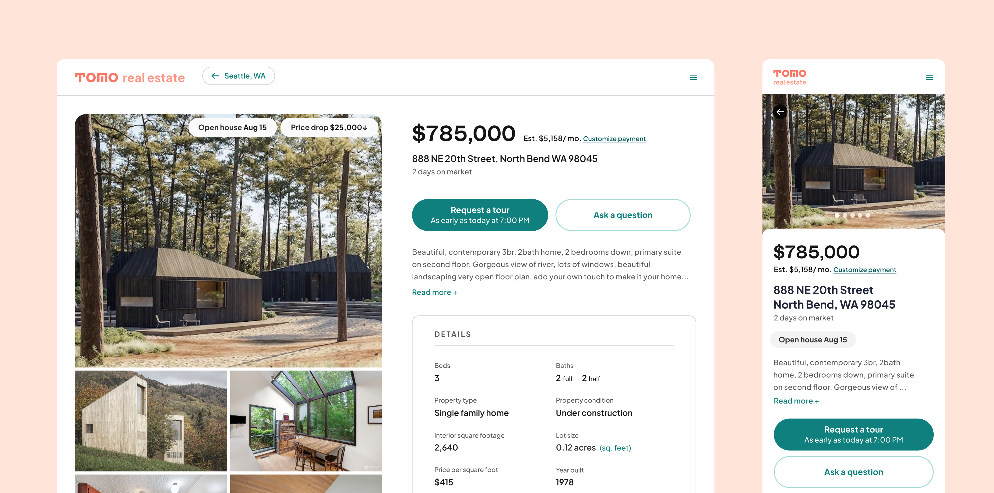
Our portal will offer a clean, approachable experience with ISAs (Inside Sales Agents) – starting with the speedy “learn-fast” launch of these two pages: the Search Results Page and Home Detail Page.
My role involved rapidly iterating and refining design layouts and visual components, while working with UX design, product, and engineering as we incorporate more features and requirements.
The target audience are homebuyers who are looking to buy within the next year, but do not yet have an agent. They aren’t seasoned investors or self-sufficient expert buyers. They’re looking for a personal connection with an expert, who can help envision what the customer’s dream of homeownership could actually look like.
Our portal will offer a clean, approachable experience with ISAs (Inside Sales Agents) – starting with the speedy “learn-fast” launch of these two pages: the Search Results Page and Home Detail Page.
My role involved rapidly iterating and refining design layouts and visual components, while working with UX design, product, and engineering as we incorporate more features and requirements.
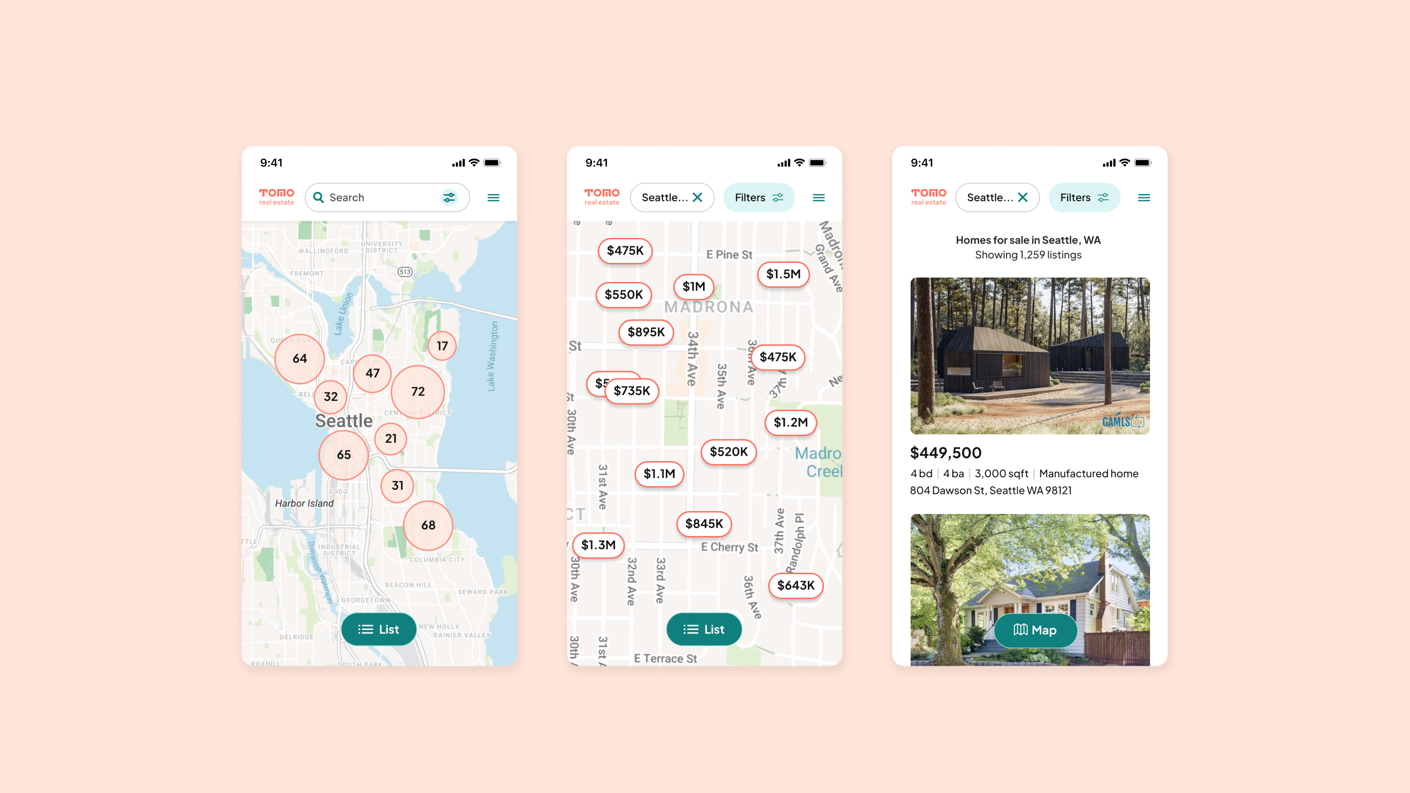
Search Results Page
Home Detail Page
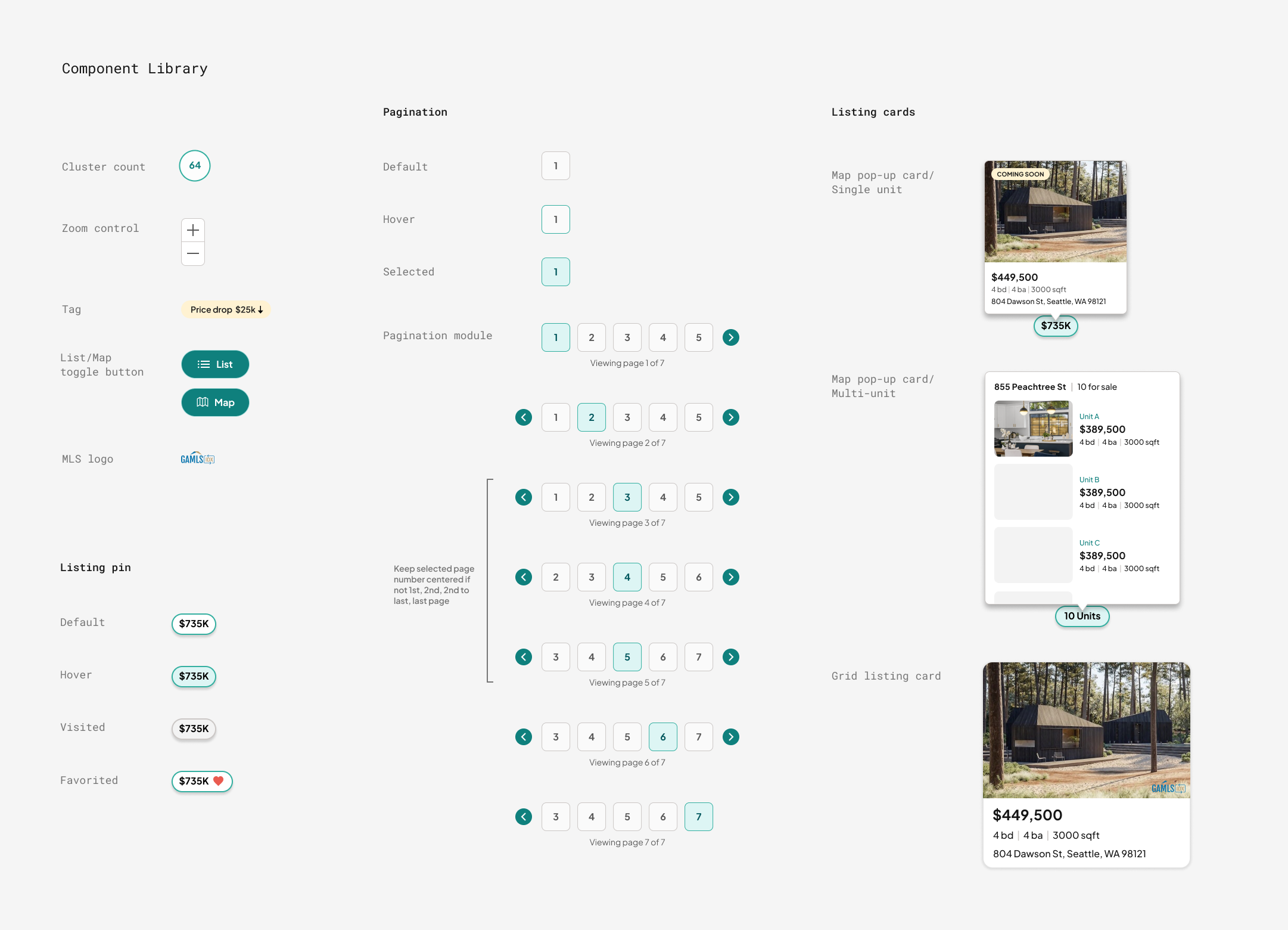
Iconography
During the design of the Home Detail Page and search bar, we wanted to create a set of icons that would appear in the Highlight Features area and Search Filters that would include themes around property types, income & assets, and home highlight features.
Knowing that icons would be the graphic elements that carry much of the delightful and engaging factors, I crafted these 60x60 icons to be simple, consistent, and visually accurate representations of the words. I worked with the co-founder to adjust for differences and nuances between home feature definitions – e.g. between “patio”, “deck”, “porch”, “veranda”, and “balcony”, or between a “mobile” and “manufactured” home.
Knowing that icons would be the graphic elements that carry much of the delightful and engaging factors, I crafted these 60x60 icons to be simple, consistent, and visually accurate representations of the words. I worked with the co-founder to adjust for differences and nuances between home feature definitions – e.g. between “patio”, “deck”, “porch”, “veranda”, and “balcony”, or between a “mobile” and “manufactured” home.
