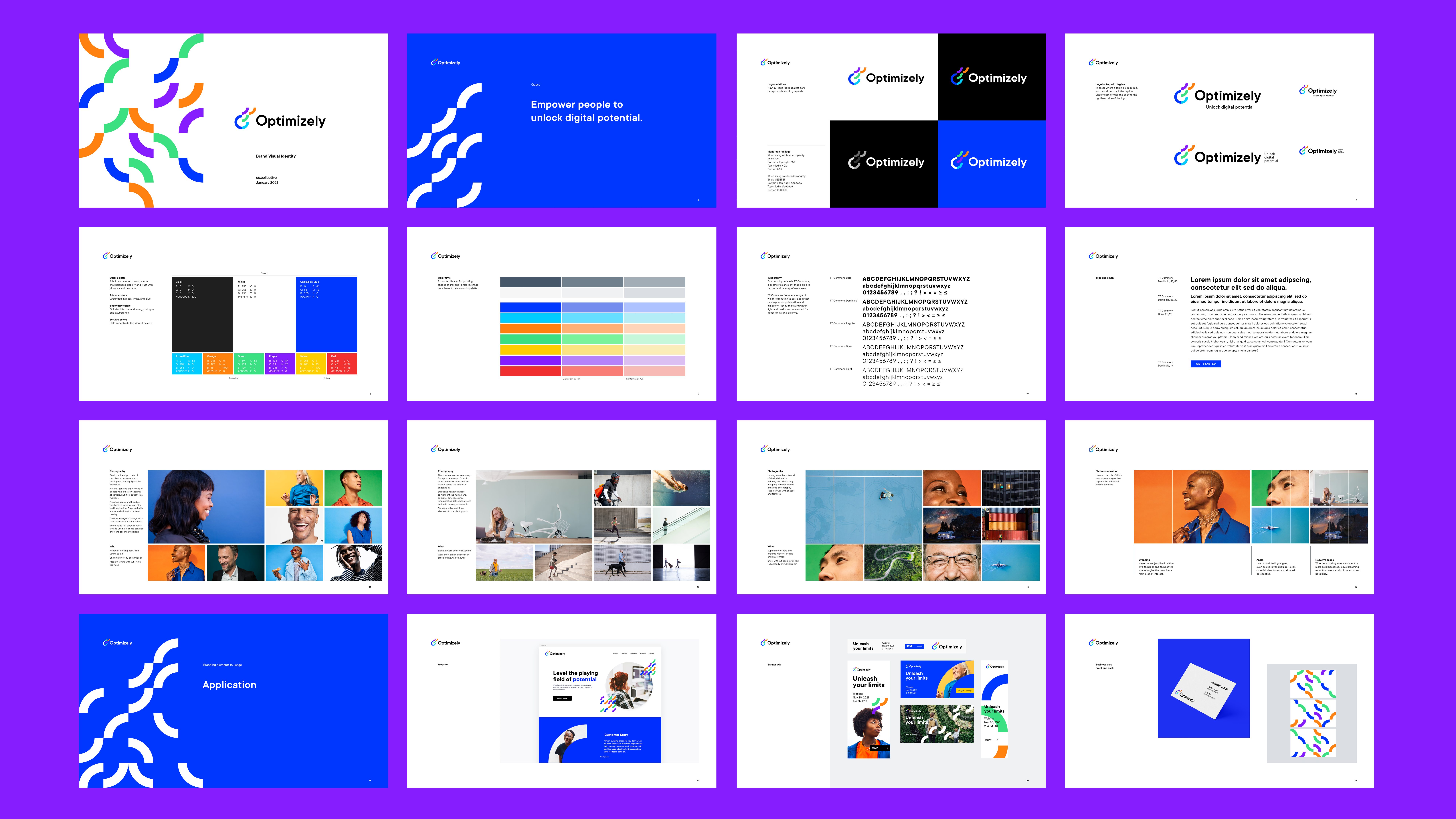
Optimizely Brand Identity 12.2020-01.2021 (6 week sprint)
Client: Episerver (acquired Optimizely in Oct 2020)
Agency: co:collective
CD: Steph Price
Strategy Lead: Marilyn Markman
Role: Visual Brand Designer
Agency: co:collective
CD: Steph Price
Strategy Lead: Marilyn Markman
Role: Visual Brand Designer
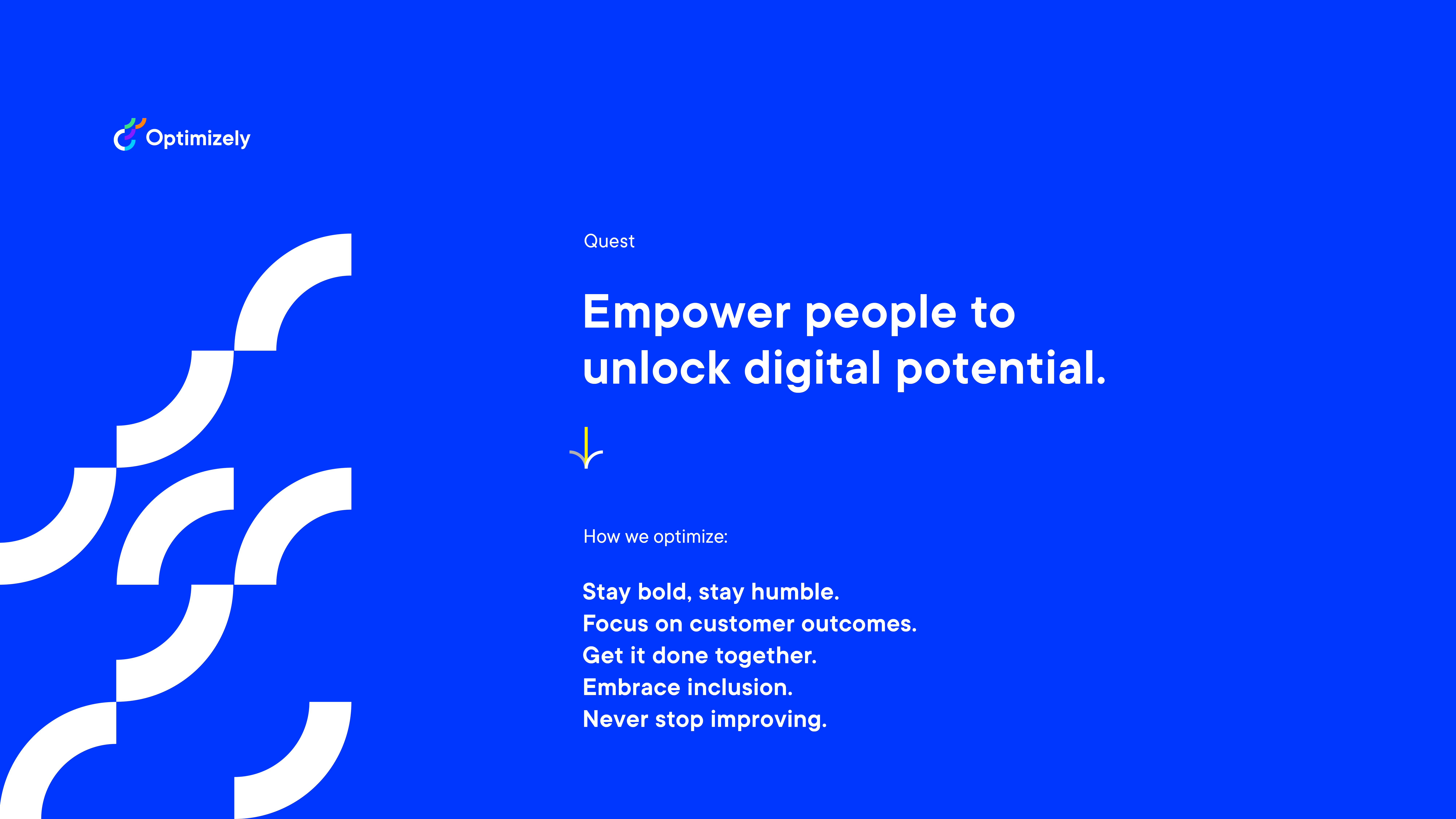
When Episerver acquired Optimizely in October 2020 and ultimately rebranding as Optimizely, they needed an unifying vision and purpose. Co:collective was tasked with defining a clear brand story that articulates brand truths and value to customers and employees in the digital experience space. The rallying quest was to “Empower people to unlock digital potential.”
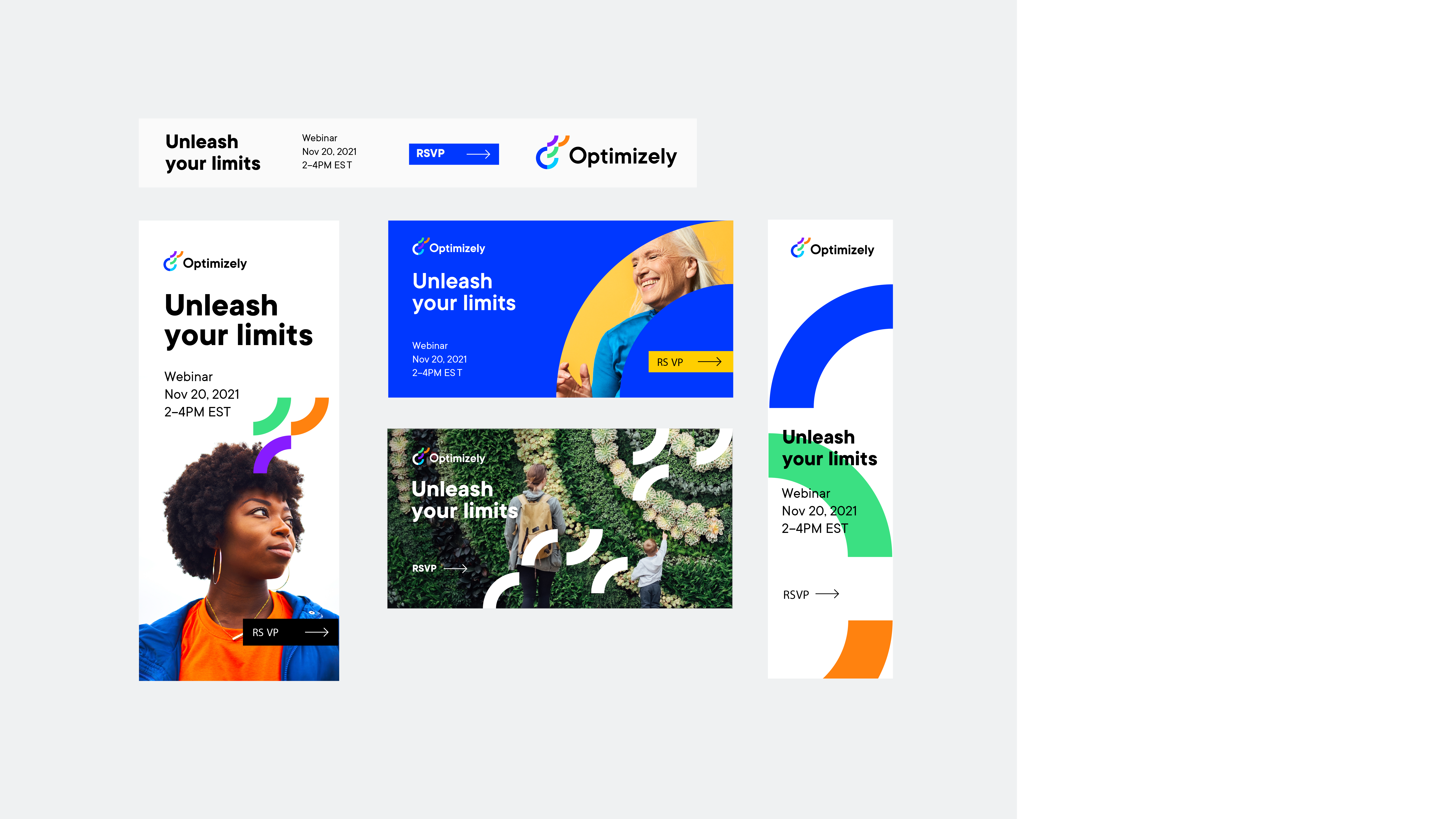
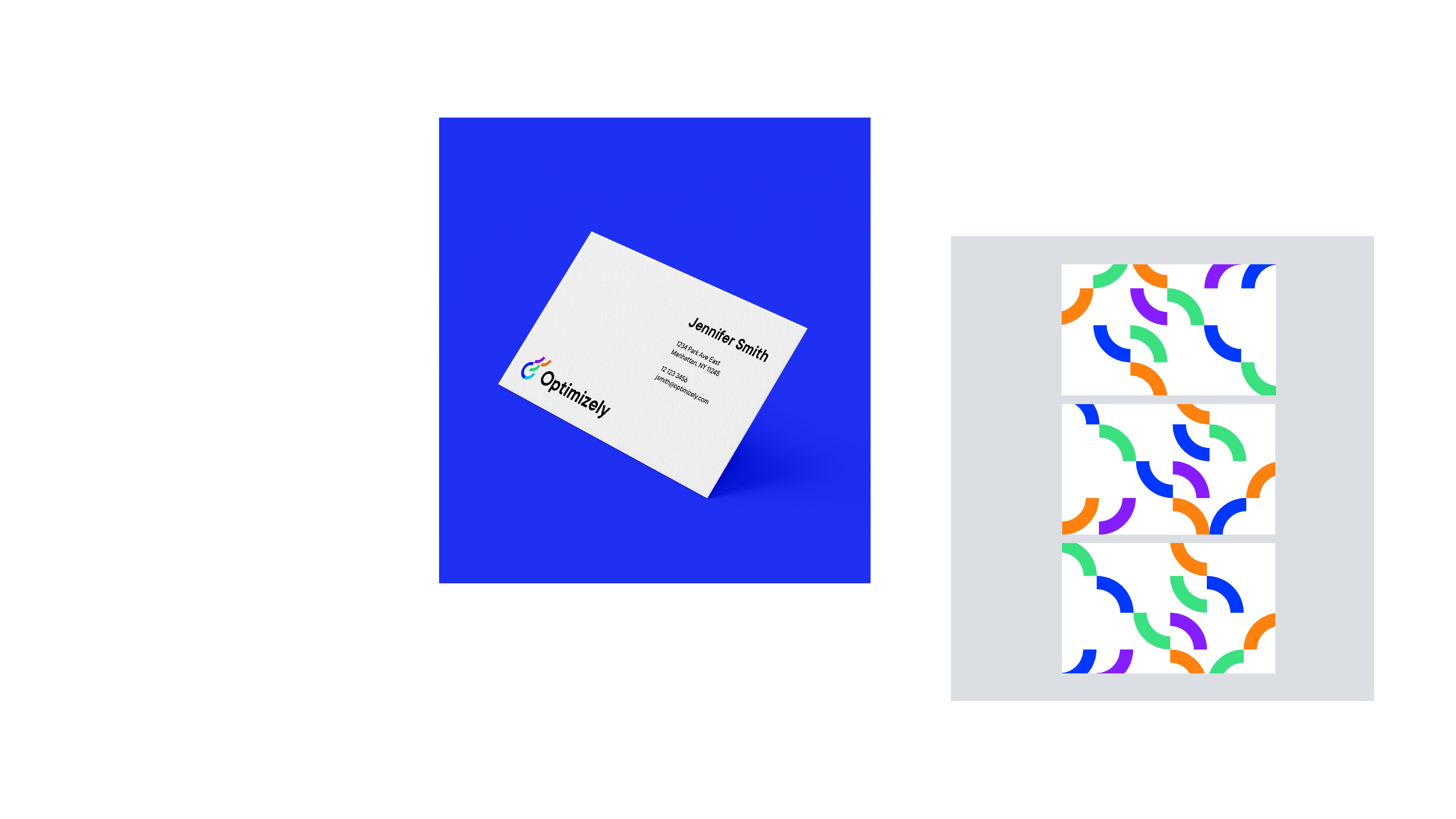
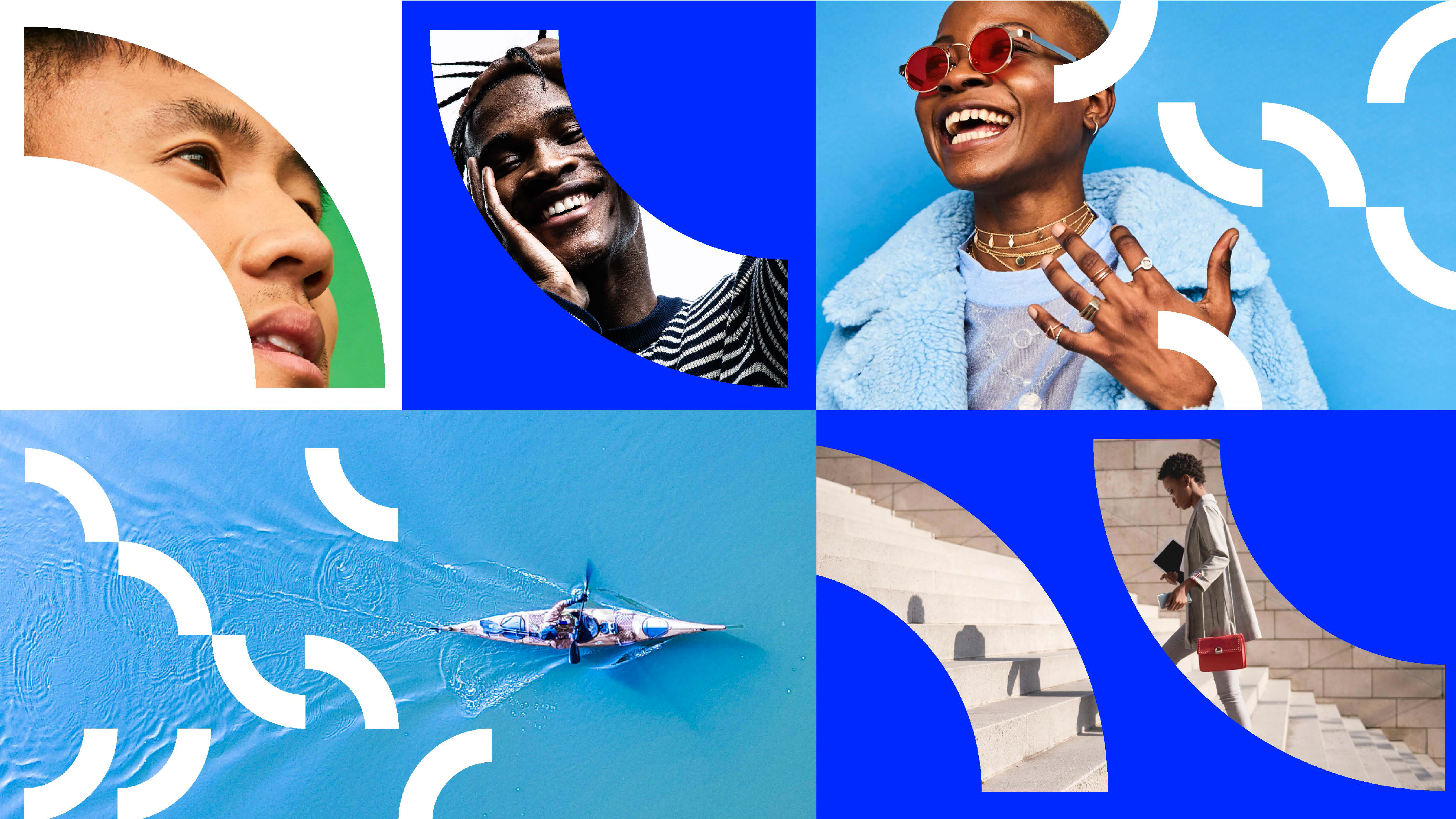
This was also an opportunity to create a new Optimizely brand identity that expresses an exciting beginning to this new chapter. From designing the new logo to developing a dynamic visual system, we focused on Optimizely’s new quest and unlocking endless possibilities.
This was also an opportunity to create a new Optimizely brand identity that expresses an exciting beginning to this new chapter. From designing the new logo to developing a dynamic visual system, we focused on Optimizely’s new quest and unlocking endless possibilities.


Our logo represents how Optimizely strives to unlock digital potential through constant experimentation and discovery. It features:
A foundational shell
The unit that stays in place, creating a feeling of stability and confidence. Through the use of a bold blue and azure blue, this core exudes strength, trust, and potential.Experimental blocks
These colorful quarter-pieces create different formations, alluding to the many possibilities we can discover when we iterate. When the quarter-pieces move around and rotate in the 3x3 grid, we get a total of about 10,000 combinations which speaks to Optimizely embracing a creative culture of constant experimentation.Upward progress
Our logomark creates an upwards movement, allowing viewers to see the learning, growth, and progress we make possible.